Wednesday, 21 October 2015
Tuesday, 20 October 2015

Monday, 19 October 2015

Availability of Our Group

The times labelled 'Free' is when everyone in the group is free and we can film for our music video.
Wednesday, 14 October 2015
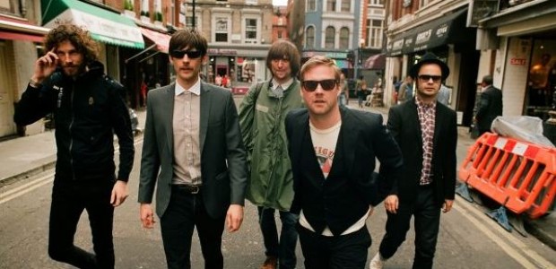
Similar Bands Photoshoots
Before we do the photo shoots for our band we thought it would be a good idea to to have a look at what other similar bands do in their photo shoots to see what kind of pictures would be good for an indie band to take.


Tuesday, 13 October 2015


Southend Shooting Schedule

This is our shooting schedule for Southend.
Reflection on shooting schedule: We feel it went well and we got all of our shots that we wanted and more, when we edit these shots along with our London shots, hopefully it will create a good flashbacks, we used lots of different camera shots: long, close up, tracking, over the shoulder etc. We filmed these shots at loads of different angles.
Parody of Genre Videos
Genre: Indie
Song:
Arctic monkeys - Cornerstone
The colours in this music video are dominated by black and white which you would expect from an indie song as black and white is often used. The performance is very understated as there is only one person performing the song. The aren't any cuts throughout the song so the video is very slow paced.
Genre: Pop
Pitbull, ft Kesha - Timber
There are much more colours in this music video which is common in pop music videos, they tend to be more visual. There is lots of voyeurism throughout the video which is often in pop videos to make the male stars look cool and powerful. There are much more cuts throughout the song as it is more fast paced and hectic which again is expected in pop music videos.
Genre: Wrap
Drake - Started from the Bottle
Again there are lots of colours in this music video which is common in wrap videos because they are more visual and quite often use lots of lighting effects in their music video. The artists are made to look very rich and powerful with expensive clothing and cars. The cutting is very frequent to keep up with the speed of the song.
Similar Genre Videos that Inspire
Imagine Dragons - Gold
I like the the lighting in this video as it creates good effects on the performance with shadows and silhouettes. The changing colour of the lighting is also interesting because it matches the mood of the song at each individual point, meaning the visual explain the song as much as the lyrics do. Also the dusty effect in the air created a good effect with the light as it made the room look foggy. We will take a lot of tips from this music video when creating our music video, especially with the lighting.
Imagine Dragons - Roots
I like the projection effect (2:51) in this music video as it is a main idea that we came up with for our video. This video shows us a good way of using the projection effect in our video, helping us add to our clips and artistic effect. We will take ideas from the projection and other parts of the video for our music video.
Jason Derulo - What If
This genre isnt't similar to our genre but the music video matches our idea of a flashback to our main characters relationship failing and also gives us some good ideas of how to shoot someone getting hit by a bus. Futhermore it gives us a good idea into how to make the audience believe what is going on is real and not a bunch of media students trying to act it. We will use certain clips and effects in our flashback for our music video.
Friday, 9 October 2015
Similar Costumes
When we perform our music video we need to make sure we look like an indie band or the video would look very unprofessional as it would seem as if 3 students are performing rather than 3 band members. For this reason we did some research into what indie bands generally wear, here are some key features:
- Smart shoes or plain trainers
- Jacket or blazer, often leather involved and often black
- Jeans almost always black, sometimes denim
- T shirt or buttoned shirt, often white or black
- Sometimes wear sunglasses
Here are some examples of indie band clothing below:


- Smart shoes or plain trainers
- Jacket or blazer, often leather involved and often black
- Jeans almost always black, sometimes denim
- T shirt or buttoned shirt, often white or black
- Sometimes wear sunglasses
Here are some examples of indie band clothing below:


Chosen Logo

This is the chosen colour scheme for our logo 'Loud Summit'. We chose this logo because we wanted to have some vibrant colour on the logo, whilst holding on to the fact that its supposed to look like a mountain top. This is why we kept the grey as it is a colour you would tend to associate with mountains, but we added the vibrant purple on the letters to add some flare to the logo.
Tuesday, 6 October 2015
Subscribe to:
Comments (Atom)